Loving the game so far, and truly think this will be the best Tennis Game ever at release.
Few things I have noticed is with arenas.
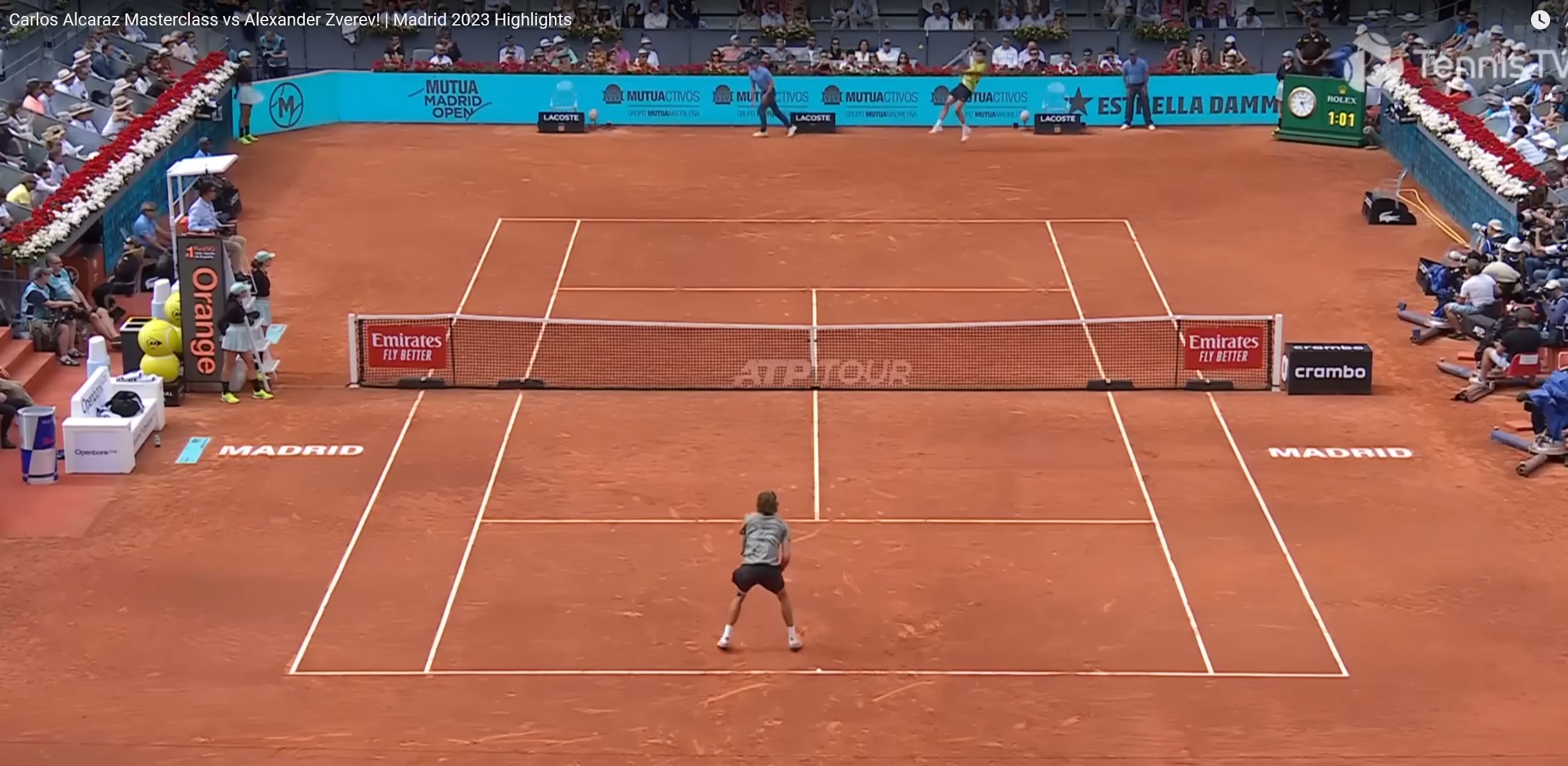
Court resolutions don’t seem to be consistent. Players, Nets, benches and courts seem to be higher res than the surrounding billboards, logos, and crowd.
- Court textures are solid, but could be improved.
---- Clay courts need grains that are larger to see the definition in the clay better
---- Make marking in the clay a lighter red color instead of the grey color that exists
---- Hard Courts need to show more court distress to improve texture look
---- Hard Courts, surrounding outside court needs to show more distress. Many times they just look like a solid color and not a court.
Surrounding signs and billboards
---- The signs and billboards on the sides do not look well textured.
---- Signs and billboards appear to be a lower resolution than even the court, net, or the players benches.
Crowd
---- Crowd could be higher res.
Specific Courts
- Indian Wells - Court IRL is purple, but in TB its blue.
Other:
Ball kids, Linesmen, need to be added.
When will 500 and 250 venues become playable?